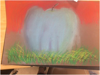
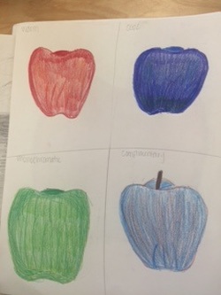
 For this apple I used chalk. I think I went too light with the chalk because I didn't show the roundness of the apple. Also, I blended the chalk too much which made it look not realistic. 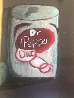 For this soda can I used oil pastel. I really don't like how this looks because the color and logo don't look right. Also, the shadow on the can does not look right because there is a lot of black then a yellowish spot that is going the opposite way which isn't right. I also should have tried to use more colors within the can. 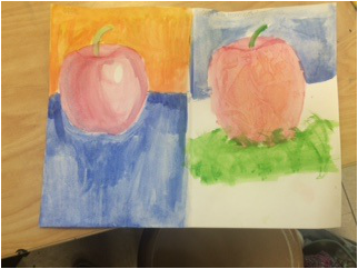 These apples are water colored and I like these the best out of all the apples. I like them so much because there are dark and light areas and you can also tell that it is round. To me, the first apple looks the most realistic out of all the apples I did. For the second apple, the techniques I used are dry brush and saran wrap. 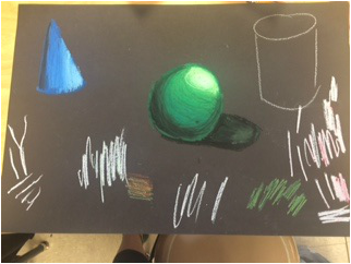 For this piece, I used oil pastels for shape shading. I realized that it was harder to blend the colors which made it difficult for it to look more realistic. Also in this piece, I was very heavy handed which is not good when using oil pastels.
0 Comments
Leave a Reply. |
AuthorWrite something about yourself. No need to be fancy, just an overview. Archives
January 2016
Categories |
 RSS Feed
