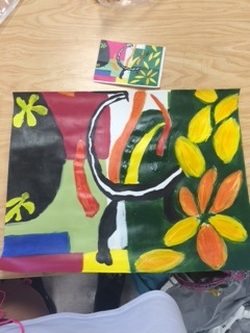
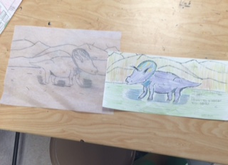
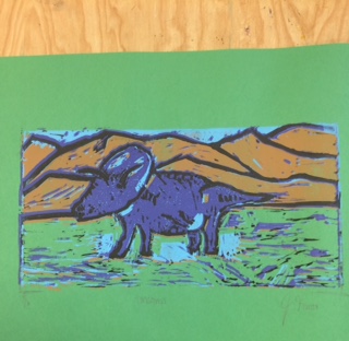
 In this project I got one fourth of a famous painting and had to copy the part I got. I learned that I needed to be careful and slow with my painting. Because I was copying someone else's piece, I needed to make sure I was doing it right. I like the left side of my piece but the right side is messed up because I did the leaves to wide and tall. If I were to do this again I would draw everything out in pencil before starting to paint. 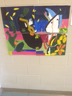 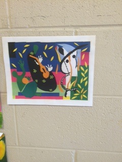
0 Comments
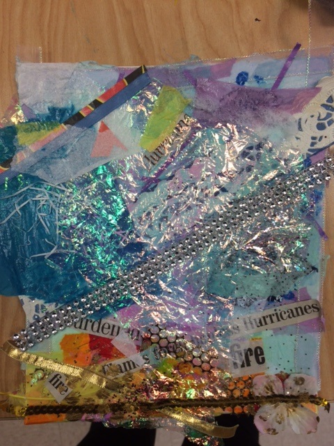
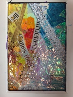
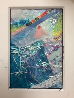 My artwork is intended to say that the bad does not outweigh the good. The red, orange, and yellow represent fire, destruction, and hurt. The blue represents water, and help. Connecting it to fire, the fire is trying to grow but the water is keeping it from doing so. When taking it in a more figurative way, the warm colors represent the hurt and bad things people go through, while the blue is the strength people have and the good things that happen to those people. Even though there will always be hurt and bad things that people go through, it will be tolerable because there will always be more good than bad. This artwork says a lot about who I am. My artwork was a message to myself. I have been through a lot in the past few years and I always need to remind myself that it always gets better. The blue represents the good things in my life like my friends, family, pets, and surprisingly school. The red represents death, anxiety, depression, and emotional hurt. Even though I will never fully get over the bad things, I will always be okay because I have good things in my life. Some issues that I am examining through my piece is the big, thick, crystal piece that just goes all the way across my art. Adding that part makes my piece look weird because it looks like it does not belong. Even though I wanted a blue and silver theme in the top part, the silver thing just does not look right. The piece looks to bulky and thick; it stands too high on my piece. If I did keep it I should have tried to do something to tone it down but I should not have added it in the first place. Another issue is that the blue part goes too far down. I wish I had the warm colors go a little higher because that part is my favorite section in my piece. Also the blue looks really overwhelming so I should have had the warm colors take up more space.
|
AuthorWrite something about yourself. No need to be fancy, just an overview. Archives
January 2016
Categories |
 RSS Feed
